Project 2
- Describe continuous, ordinal and nominal data. Provide examples of each. Describe a model of your own construction that incorporates variables of each type of data. You are perfectly welcome to describe your model using english rather than mathematical notation if you prefer. Include hypothetical variables that represent your features and target.
Continuous data is numerical data that can take on a range of values. Example: temperature, income, or someone’s height.
Ordinal data is also numerical data, but unlike continuous data, only the order of ordinal values is important rather than their difference. Example: athletic ranking
Nominal data is categorical like labels. Example: country, color, or gender.
A model that incorporates all types of data: For a model to predict wine’s quality index which is the target, features can include the type of the wine (red or white), the price of wine, volatile acidity level, and chlorides level. The price of the wine, the volatile acidity level, and the chlorides level are continuous data. The wine quality index is an ordinal data. The type of the wine is a nominal data.
- Comment out the seed from your randomly generated data set of 1000 observations and use the beta distribution to produce a plot that has a mean that approximates the 50th percentile. Also produce both a right skewed and left skewed plot by modifying the alpha and beta parameters from the distribution. Be sure to modify the widths of your columns in order to improve legibility of the bins (intervals). Include the mean and median for all three plots.
Symmetric:
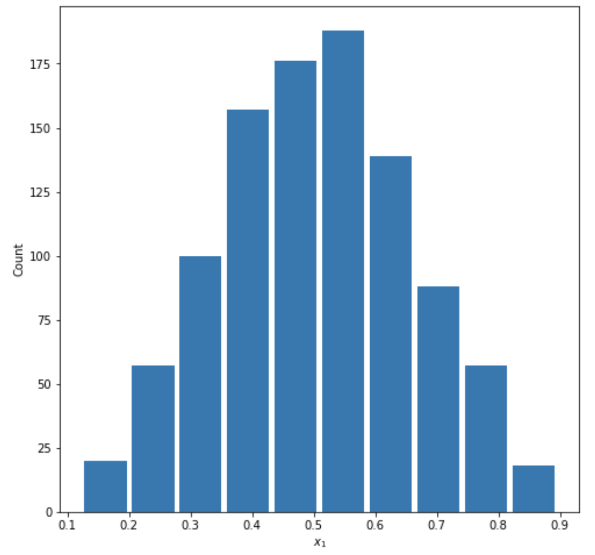
Mean= 0.5042389951787236
Median= 0.504401068527123
Right Skewed:
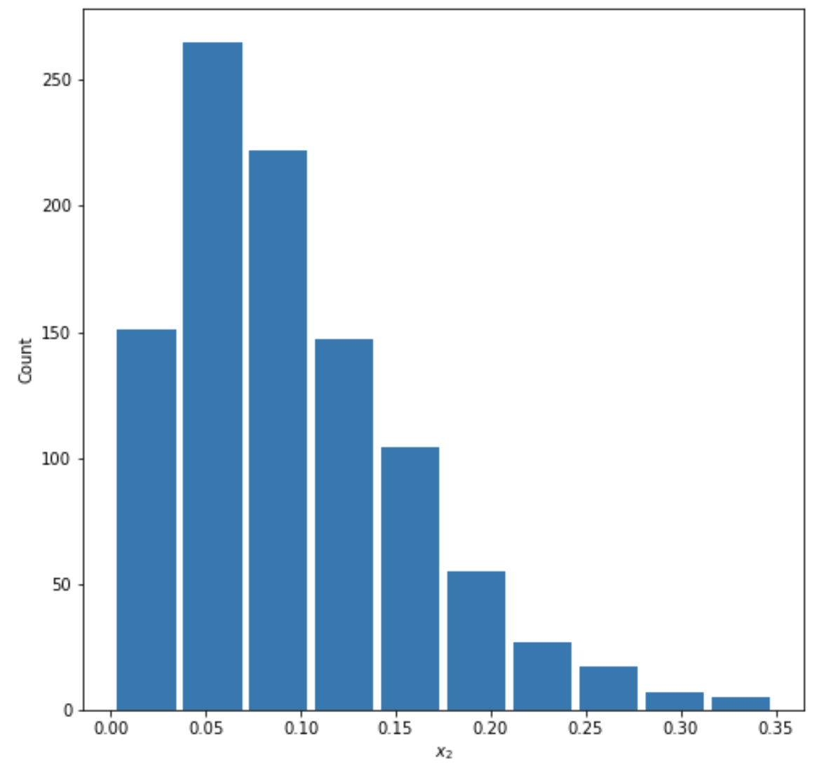
Mean=0.09593092764661984
Median=0.08272532110992745
Left Skewed:
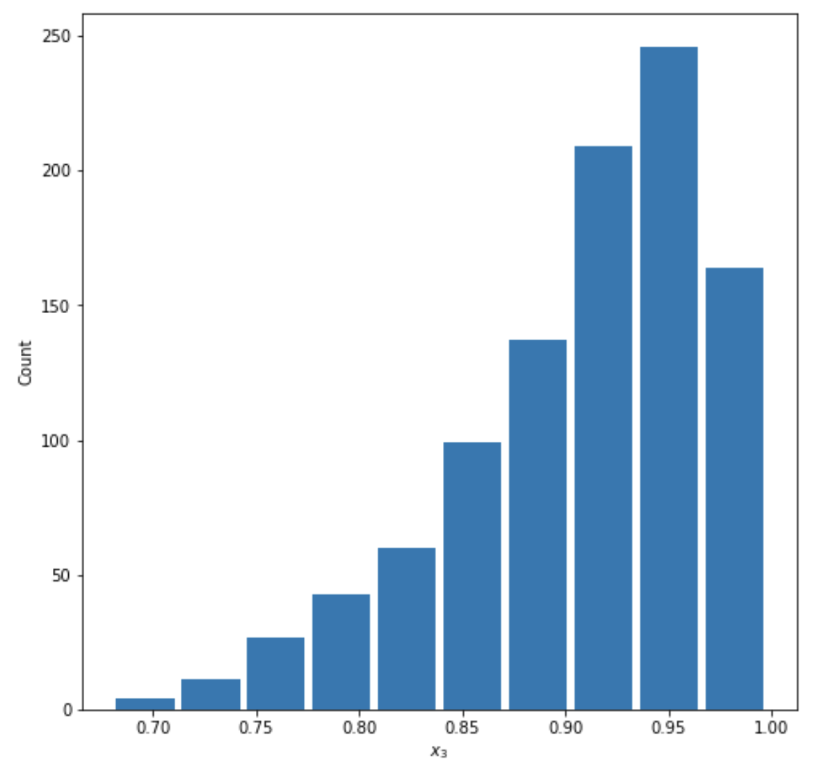
mean=0.906886211618868
median=0.9201854902191089
- Using the gapminder data set, produce two overlapping histograms within the same plot describing life expectancy in 1952 and 2007. Plot the overlapping histograms using both the raw data and then after applying a logarithmic transformation (np.log10() is fine). Which of the two resulting plots best communicates the change in life expectancy amongst all of these countries from 1952 to 2007?
Raw data plot:
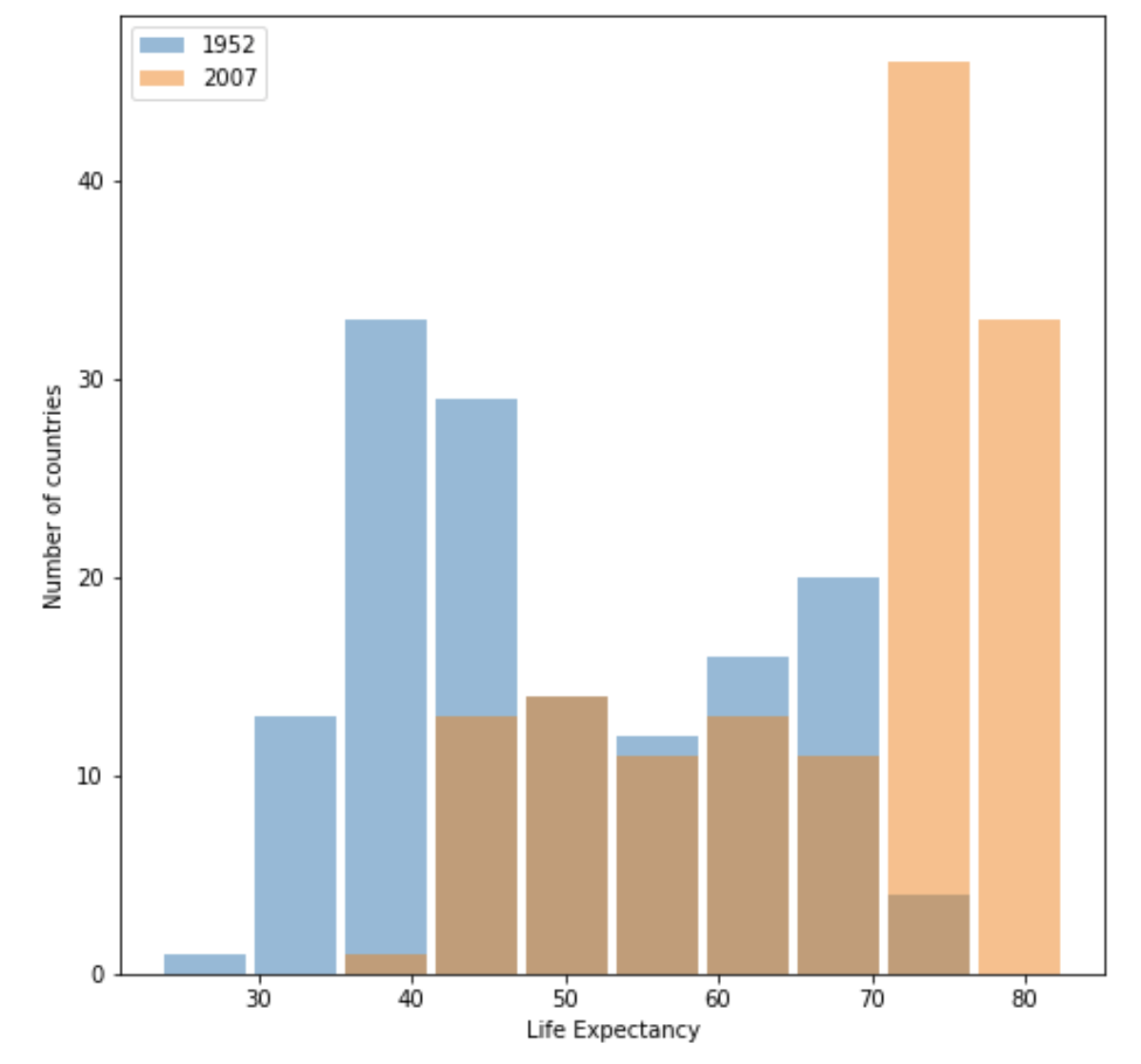
Plot after logarithmic transformation:
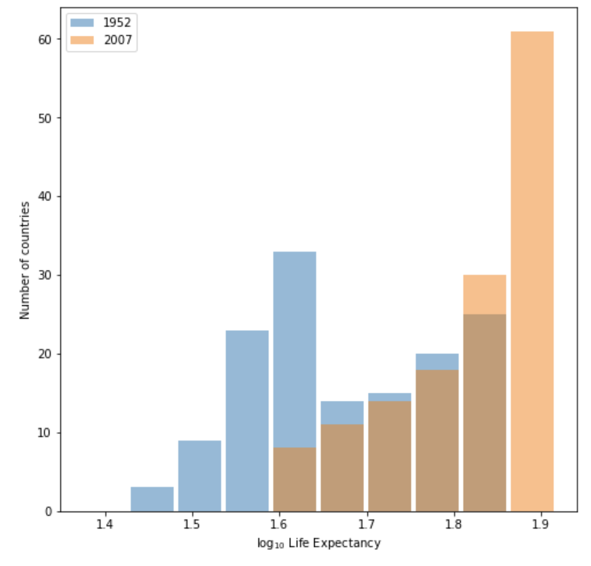
I think the raw data plot best communicates the change in life expectancy from 1952 to 2007. Although both graphs show the difference clearly, without logarithmic transformation, the labels on x axis of raw data plot directly reflect the real life expectancy, which makes it easier to interpret. So I think there is no need to apply a logaristhmic transformation in this case.
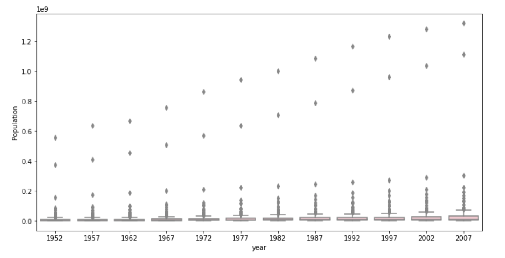
- Using the seaborn library of functions, produce a box and whiskers plot of population for all countries at the given 5-year intervals. Also apply a logarithmic transformation to this data and produce a second plot. Which of the two resulting box and whiskers plots best communicates the change in population amongst all of these countries from 1952 to 2007?
Raw data plot:
Plot after logarithmic transformation:
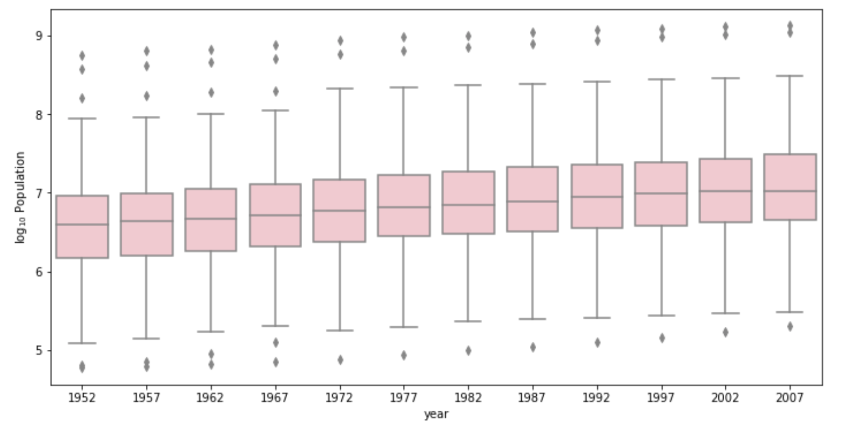
The plot after logarithmic transformation best communicates the change in population as it clearly shows both the box itself and the increasing trend of population on average. Because of several huge outliers, the boxplot drawn from raw data is difficult to read.